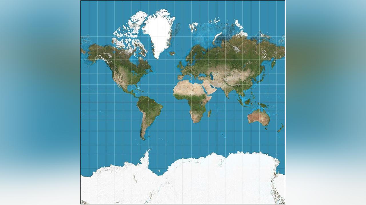
Africa-Press – South-Sudan. Africa’s landmass is so big that Russia, China, India and the United States could fit in it. But that’s not the impression you get when you look at the world map that’s been in use for more than 450 years.
The widely used Mercator world map, which allegedly ‘shrinks’ or ‘distorts’ Africa’s size, recently attracted global attention after the African Union (AU) endorsed a campaign that seeks to replace it with a map that shows the continent’s true land mass.
Africa is 30.37 million square kilometres, Russia, the world’s largest country, is 17.1 million square kilometres, the US is 9.867 million km2, China is 9.597 million km2, and India 3.287 million km2.
Africa is the second largest continent after Asia, which has 44.58 million square kilometres.
On the Mercator projection, the African continent looks about the same size as Greenland. Yet Greenland is just 2.166 million square kilometres, or 14 times smaller than the actual size of Africa.
Why does it matter?
The Mercator projection is still widely used, including by schools and tech companies. Google Maps switched from Mercator on desktop to a 3D globe view in 2018, though users can still switch back to the Mercator if they prefer. On the mobile app, however, the Mercator projection remains the default.
The AU-backed ‘Correct The Map’ campaign, led by Africa No Filter and Speak Up Africa, has reignited the debate, promoting the 2018 Equal Earth projection that better reflects countries’ actual sizes.
“The current size of the map of Africa is wrong,” Moky Makura, executive director of Africa No Filter, said recently in an interview with Reuters. “It’s the world’s longest misinformation and disinformation campaign, and it just simply has to stop.”
Fara Ndiaye, co-founder of Speak Up Africa, said the Mercator affected Africans’ identity and pride, especially children who might encounter it early in school.
“We’re actively working on promoting a curriculum where the Equal Earth projection will be the main standard across all (African) classrooms,” Ndiaye said, adding she hoped it would also be the one used by global institutions, including Africa-based ones.
‘Correct The Map’ wants organisations like the World Bank and the United Nations to adopt the Equal Earth map. A World Bank spokesperson said they already use the Winkel-Tripel or Equal Earth for static maps and are phasing out Mercator on web maps.
Who drew Mercator world map?
The Mercator projection is a type of map projection introduced in 1569 by Gerardus Mercator, a Belgian (Flemish) geographer and cartographer.
It is often described as a cylindrical projection. According to the Encyclopedia Britannica, the meridians on the Mercator projection are equally spaced parallel vertical lines, and the parallels of latitude are parallel horizontal straight lines that are spaced farther and farther apart as their distance from the Equator increases.
The Mercator projection is widely used for navigation charts, the authors of the encyclopedia wrote, because any straight line on a Mercator projection map is a line of constant true bearing that enables a navigator to plot a straight-line course. It is less practical for world maps, however, because the scale is distorted; areas farther away from the Equator appear disproportionately large.
The problem with the Mercator projection of the world map is that it converts the spherical Earth into a cylinder that opens at the poles to create a flat map.
For More News And Analysis About South-Sudan Follow Africa-Press


