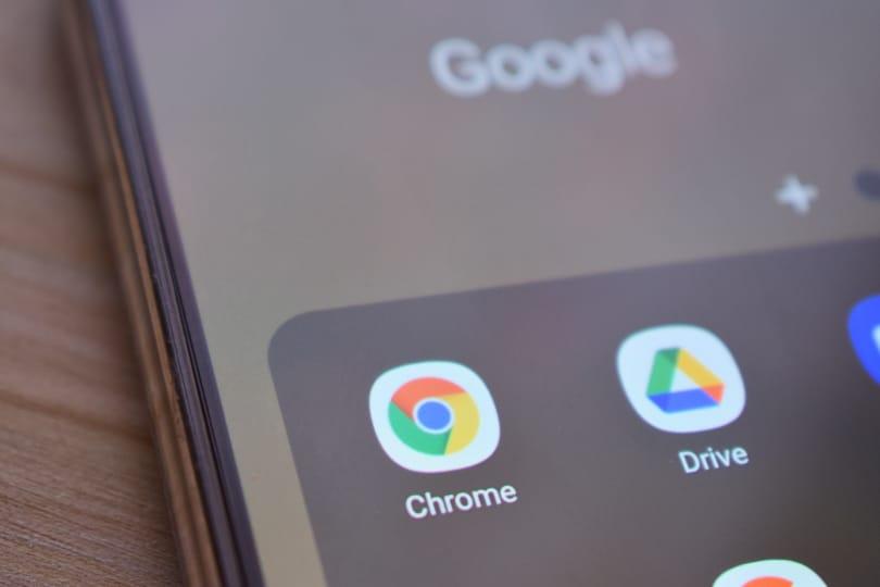
Africa-Press – Kenya. Chrome has admitted it will for the first time since 2014 change its logo in months to come.
Elvin Hu, a designer for chrome, offered the first look for the logo’s redesign on a thread on his Twitter handle.
“We are refreshing Chrome’s brand icons for the first time in 8 years. The new icons will start to appear across your devices soon,” Hu said.
The refreshed version will take effect in apps, on the web, and beyond.
We simplified the main brand icon by removing the shadows, refining the proportions and brightening the colors, to align with Google’s more modern brand expression. pic.twitter.com/Hyig51gqJq
Hu says the logo will appear more 3D than the older versions but the main Chrome logo (the one you click on from your dock/taskbar to access the web) will look different across all systems.
“On ChromeOS, the logo will look more colourful to complement the other system icons while on macOS, the logo will have a small shadow, making it appear as if it’s “popping out” of the dock.”
He said the colours in the logo will appear more vibrant, essentially “rising” them off the screen.
“We discovered ‘placing certain shades of green and red next to each other created an unpleasant color vibration.’ To fix this and make the icon ‘more accessible’, we decided to use very subtle gradients to prevent any colour vibration.”
Hope you enjoy it, and please send us screenshots & feedback if there are use cases we could improve! 🙏
For More News And Analysis About Kenya Follow Africa-Press


